If selecting elements is easy, building is easy.
Shogun Page Builder promises polished and custom pages at the speed of a few clicks. However, in a fiercely competitive no-code landscape, some high-traffic building interactions were hard to use and slowed our users down.
Growing an E-Commerce business requires rapid iteration. The very life of a DTC shop depends on how effectively it communicates with its customers using words and visuals to improve conversion and overall satisfaction. Building shouldn't be a chore.
Project
Selecting & building with elements
Role
Lead designer on agile project team
Objective
Make it easy to select elements, build, and organize the structure of a page.
The "selection & building" challenge
Problem
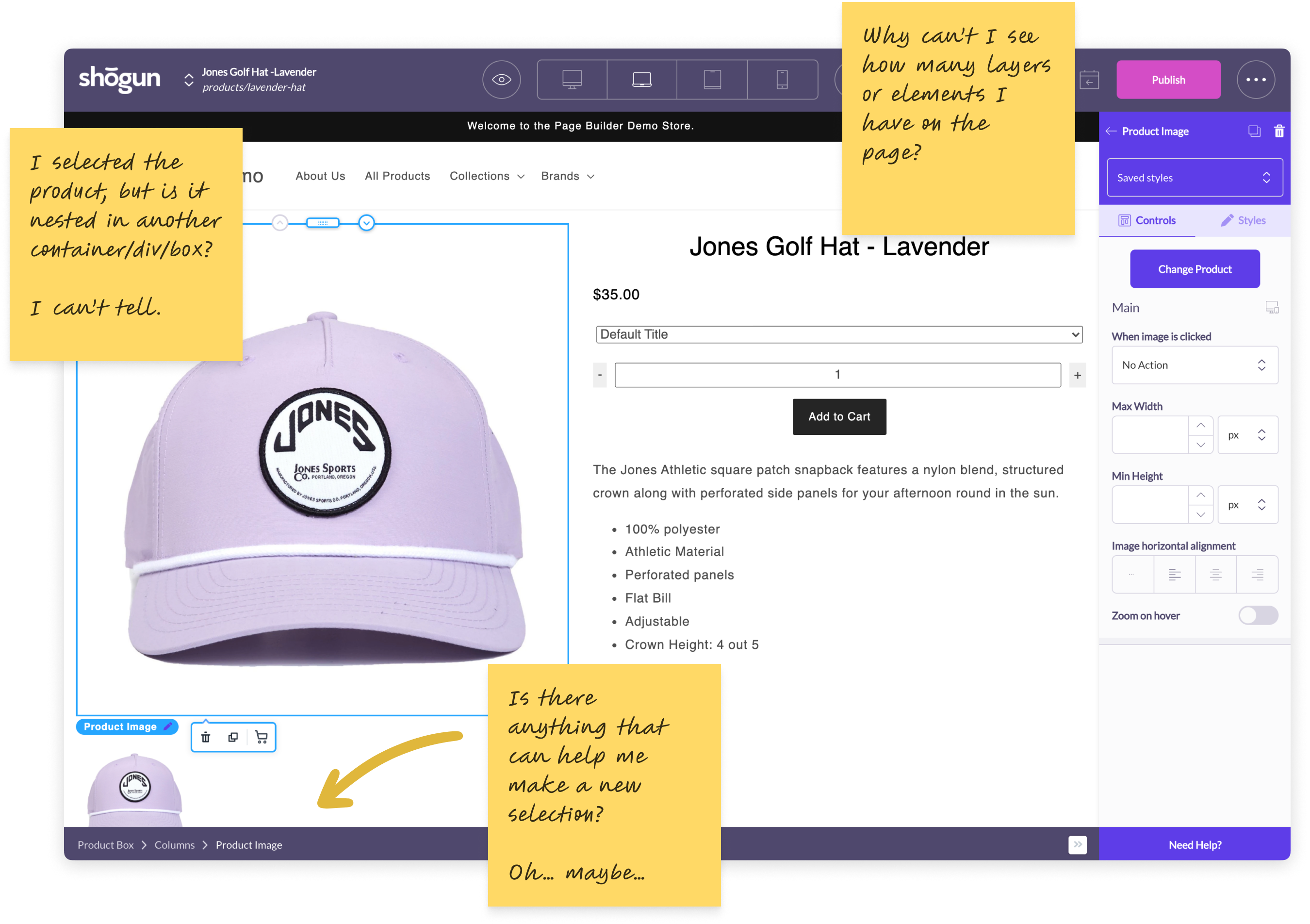
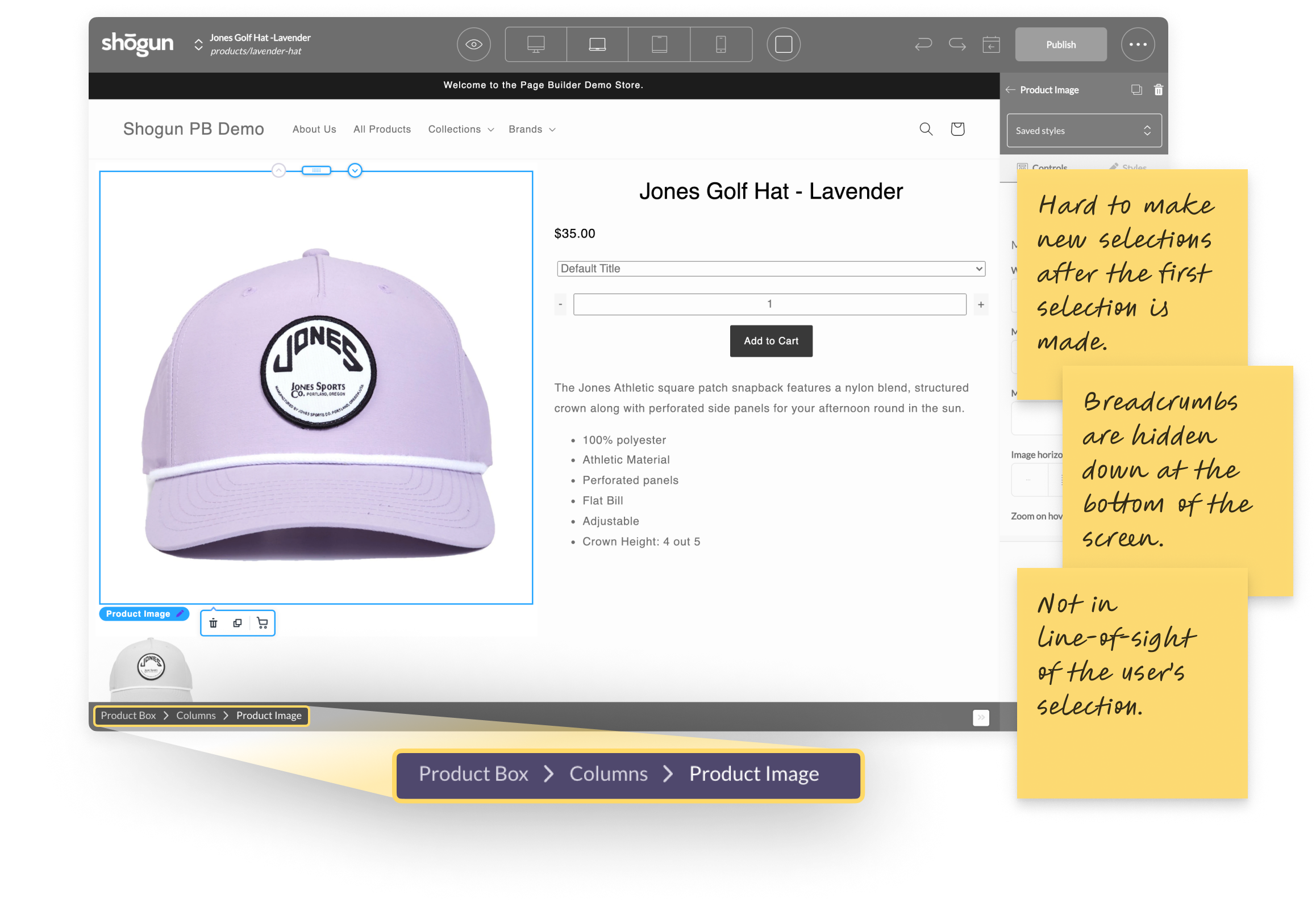
It’s difficult to make targeted selections when there are nested elements. When a child element is selected, THERE IS NO WAY to tell its relationship to its parent just by looking at the canvas. When selection is difficult, it becomes hard to style, move, and build with nested elements.
The result: building and laying out a page is tedious when creating custom sections.
Goals
User goals
I want to build new custom sections and whole pages quickly.
Shogun pages must look like my brand.
I do not want to dumb down my ideas just to launch something.
Business goals
Make building easier for new users.
Improve the quality of life for existing users.
Reduce support burden.
The solution: Bringing nested selection on canvas
Knowing where to start
Knowing where to start took a three-pronged approach. I audited our tool and spoke with our user research and support teams. It was clear that the problem could be solved from multiple angles and with different levels of complexity. We decided to start with a lower effort / higher impact solution – redesigning Breadcrumbs was the answer.
Redesigning breadcrumbs on canvas
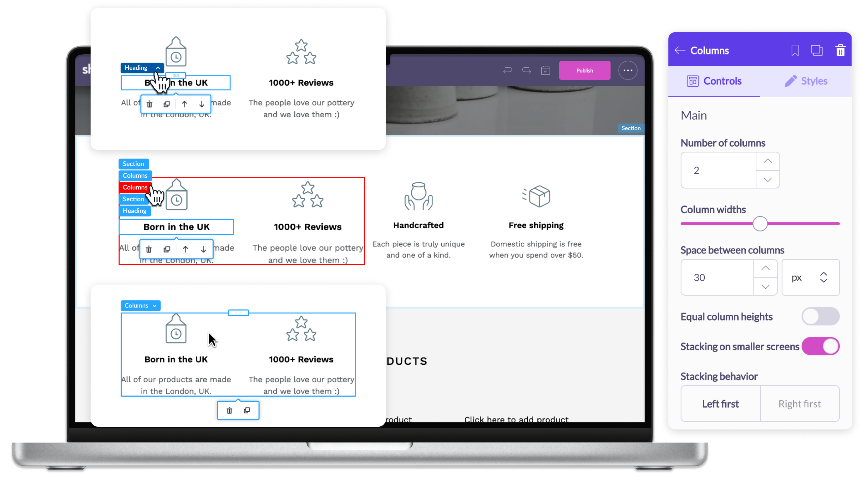
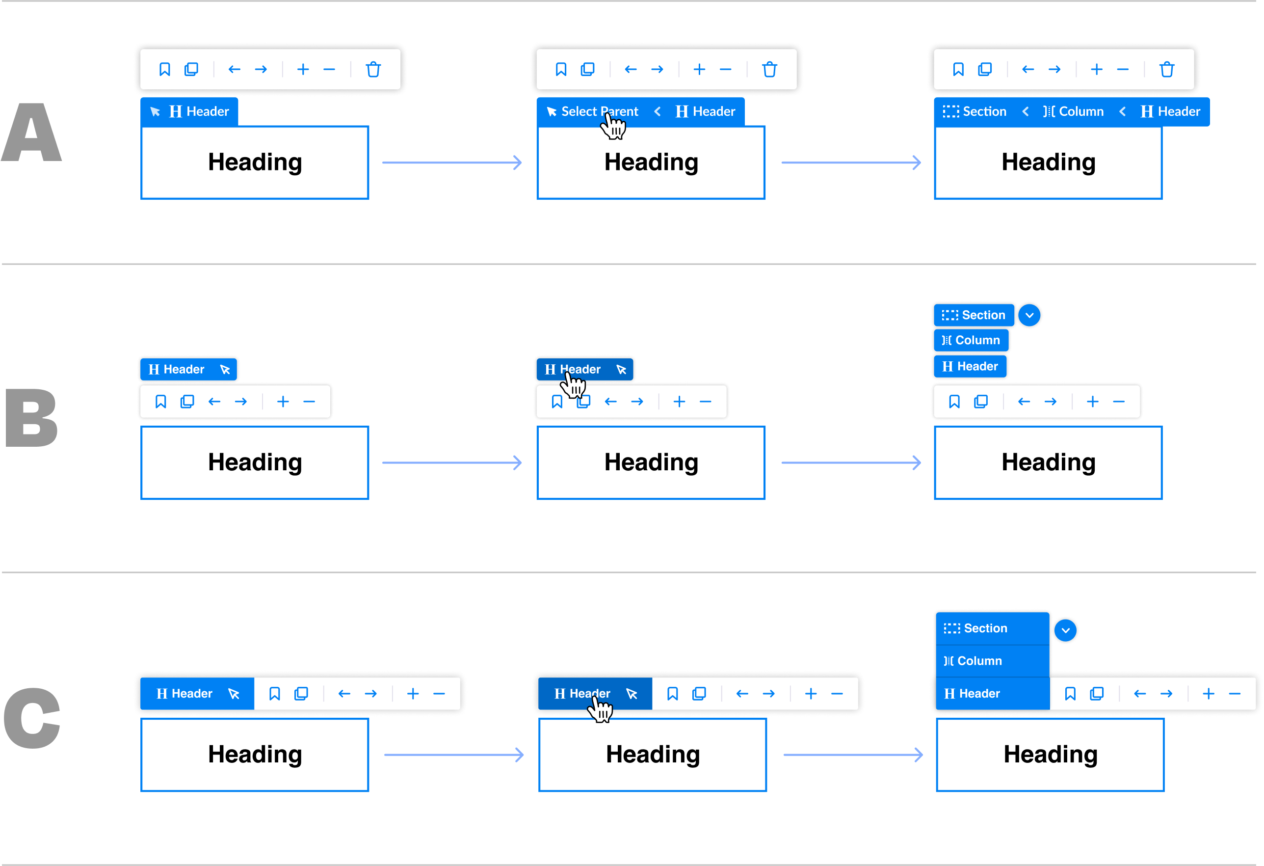
Redesigning Breadcrumbs was the answer because the feature already existed but was so hidden that many users didn't even know they were there. I saw an opportunity to bring breadcrumbs onto the canvas and connect it to a selected element. The small but mighty feature is now in the user's line of sight.
Insights
- Breadcrumbs make nested selection much more obvious and easy.
- Breadcrumbs clarify relationships of elements (parent/children).
- When selecting elements is easier: building, styling, and organizing a page is much easier.
You can't style what you can't select
To style or control an element, you must first select it. It was easy to select visible child elements but very hard to select parent containers, columns, or rows to update styling and behavior. Breadcrumbs on canvas make it easy to select harder-to-find parent elements.
Why was the old way broken?
Even if the user knew Breadcrumbs existed, the outdated feature came with other usability issues:
Old Breadcrumbs did not give visual clues on canvas when making a new selection. This made it hard to see the nested relationship of elements.
Old Breadcrumbs required a large mouse gesture to use quickly. Using breadcrumbs is a tedious physical task to do constantly.
Old Breadcrumbs did not help the user make sense of the spatial relationships of elements on the canvas.
Fixing what's broken
The first step in fixing Breadcrumbs was making them discoverable by bringing them on canvas. From there, I tackled each usability issue:
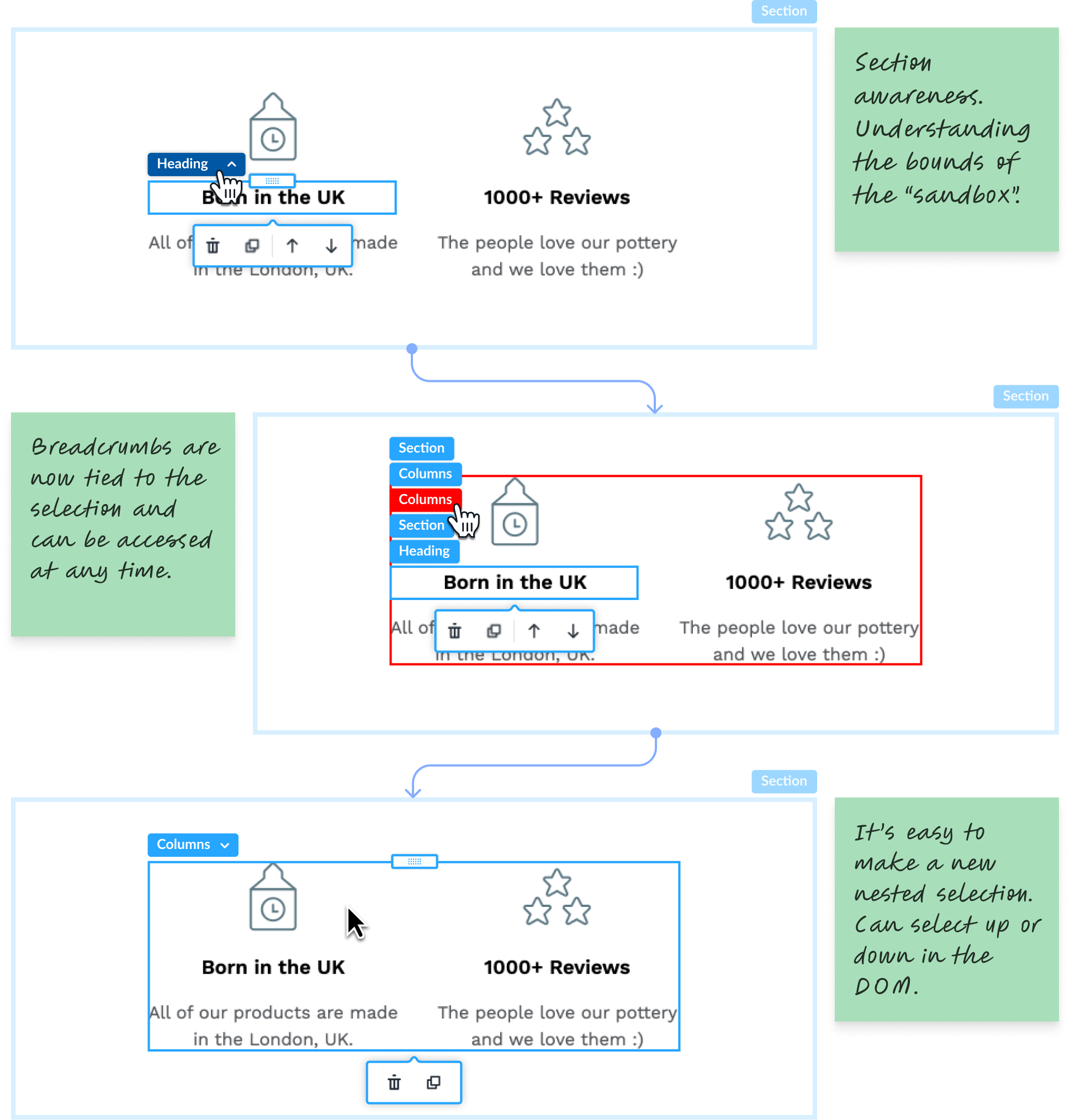
New Breadcrumbs give visual clues for active nested sections and also provide passive awareness of top-level container elements.
New Breadcrumbs are now visually tied to the selection and can be accessed at any time with the flick of the wrist. No large mouse gestures.
New Breadcrumbs helps the user understand the spacial relationship of elements on the canvas.
How we got there
Uncovering the problem & learning why selection matters
Our new and existing users were running into speed bumps when using Shogun Page Builder. After speaking with the research and customer support teams, I identified some user pain points.
Insights
Selection is critical for styling elements and building a page.
Nested or secondary selections of elements are not intuitive, even for veteran users.
The support team was constantly educating users about selection and styling – interactions that should be self-evident.
A tale of two features
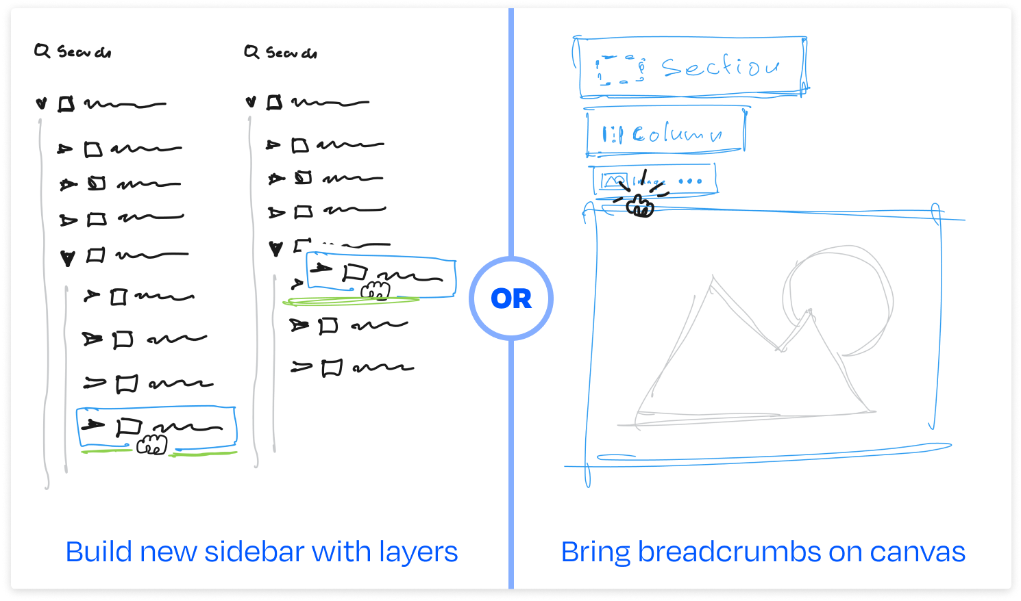
There were two main ways to solve the selection and building problem – the Layout Panel & Breadcrumbs. Both features were hidden, and both came with usability issues. The Layout Panel would be a complex design and technical, so we started by solving Breadcrumbs to make an impact quickly.
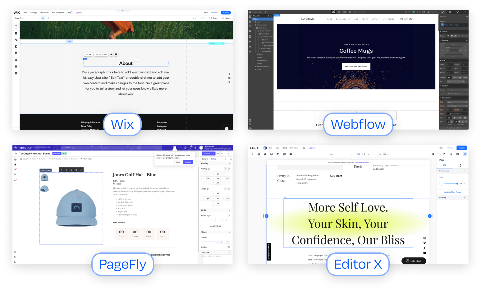
How does it work in other tools?
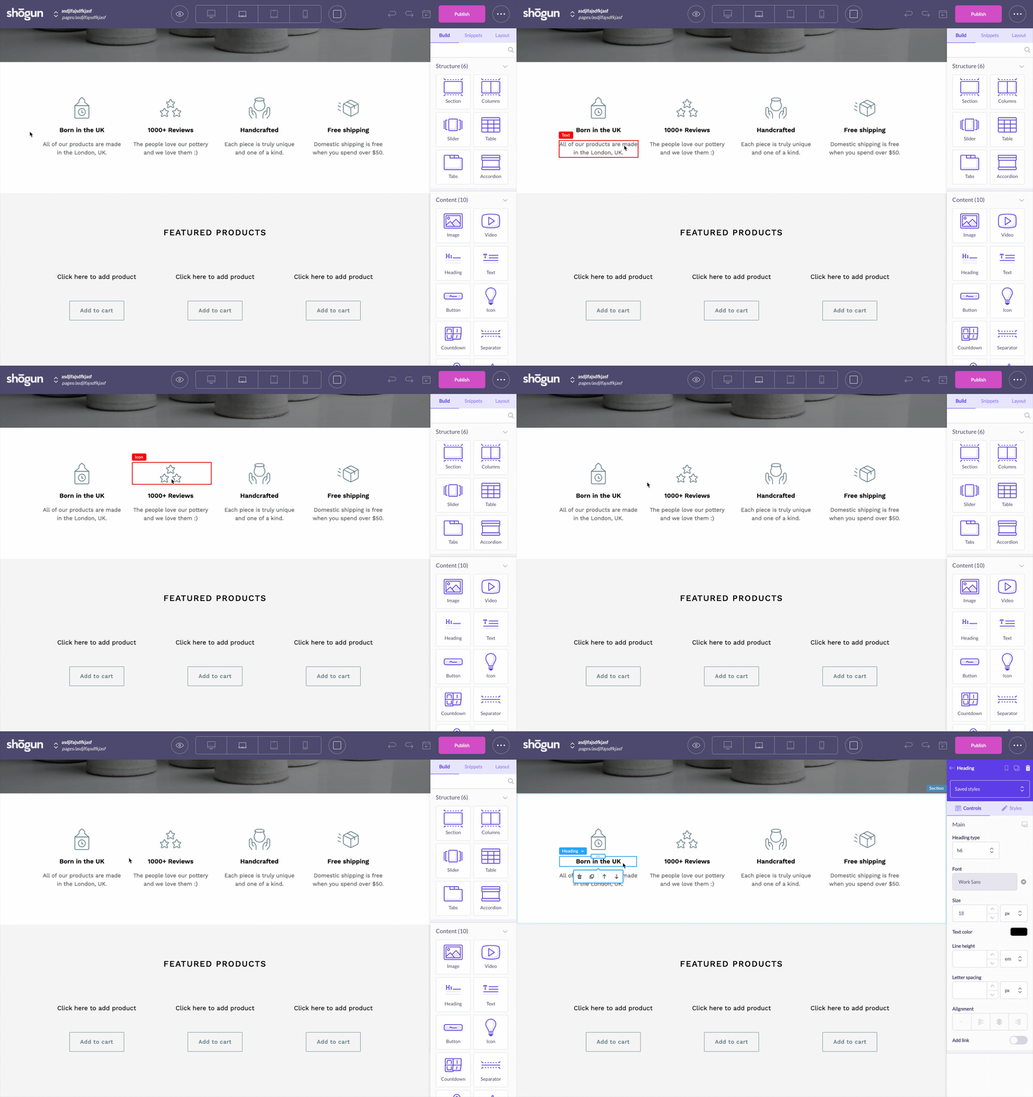
Of course, I had to look under the hood of various no-code builders. I found cosmetic similarities at first glance but, digging deeper, I saw many different interaction patterns and affordances that seemed to have two reasons: (1) they supported building patterns for that tool (2) they were quirks of their system, we all have them.
Exploring Breadcrumb interactions
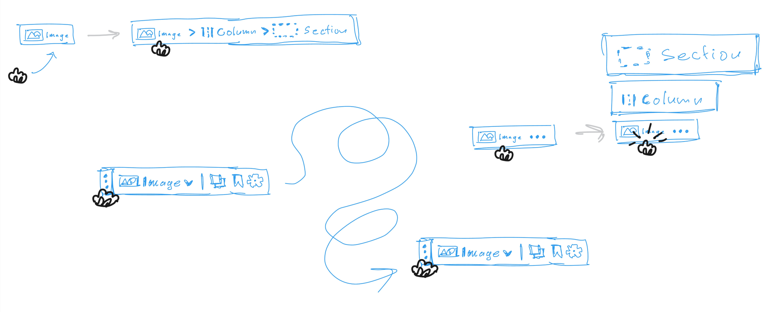
Once the problem was rooted in user and business needs, the next step was dialing in the interaction patterns. A lot is happening in the Page Builder interface, and it can be overwhelming for users. The goal was for Breadcrumbs to be available and obvious when needed and fade into the background when they're not. Below is a sampling of my medium-fidelity explorations.
The Layout Panel is the next frontier
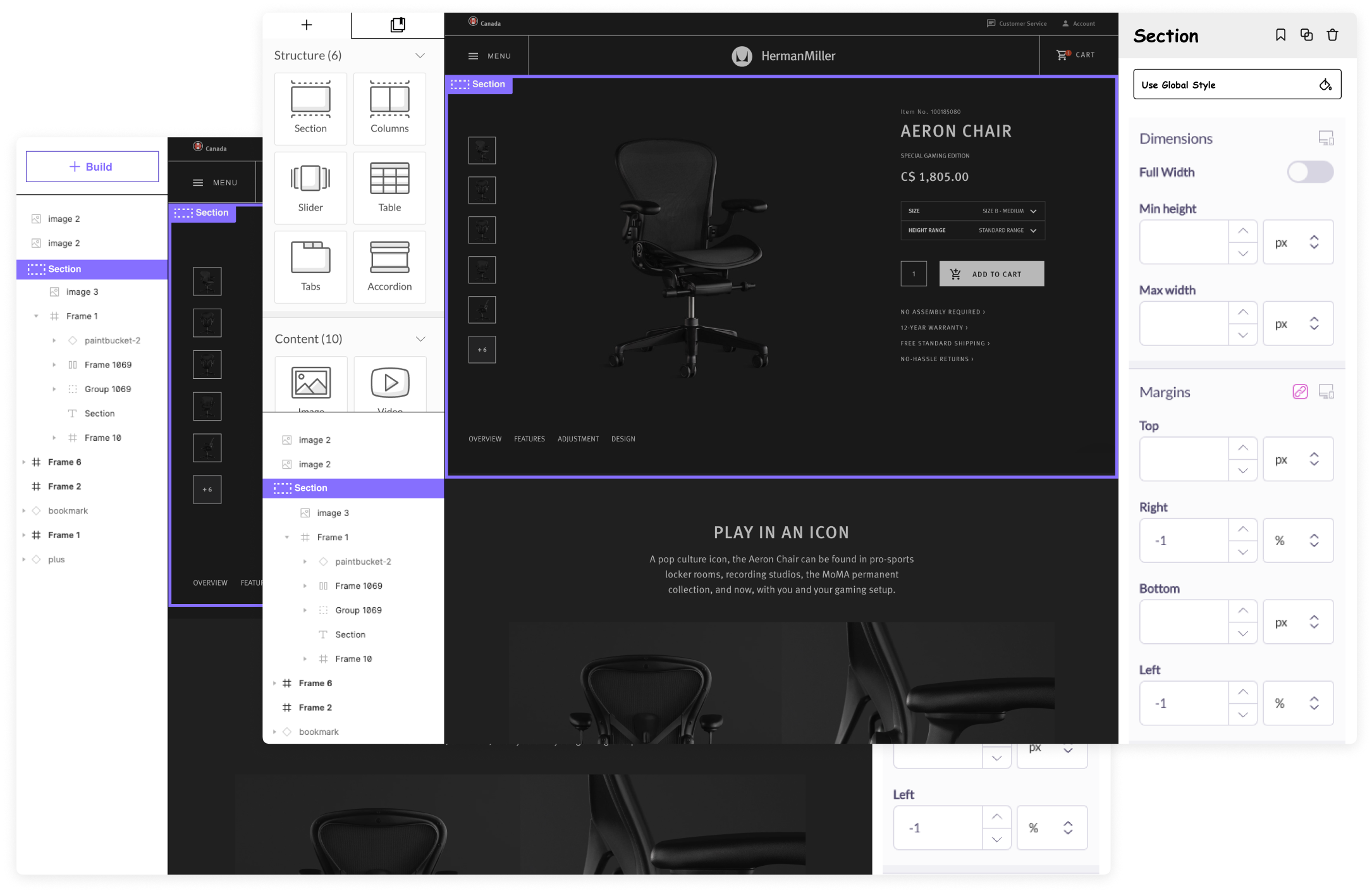
The Layout View hides in the right-hand panel under the third tab. When users find it, it can be frustrating. They want to use the panel for element selection, page navigation, and page organization, but this functionality does not exist. They can see and select elements but not reorganize or move them.
When building & styling, the Layout View can be a jarring experience. The user has to switch back and forth between Layout View & Styling View. Furthermore, even if we add functionality, they cannot build & style elements while also looking at their page layout (access to these tabs is mutually exclusive).
These panels must be separated to unlock a much faster and more confident building experience.
Impact & reflections
After a couple of rounds of exploration, scrappy user testing, and feedback from the design team, I prepared dev-ready files and worked with the engineering lead to define the production spec. My product manager and I were confident that this small but mighty improvement would unlock easier page-building.
I also learned that there was so much more work to do and the feature-functionality overlap in a no-code tool is a blessing and a curse. It was obvious to me that the Layout Panel was the next frontier for making building fun and fast. In fact, a new vision for a more ergonomic cockpit was forming. The goal: don't make the user think about building, styling, and organizing a page.
Work About
