Destroying creators-block by making a new tool discoverable
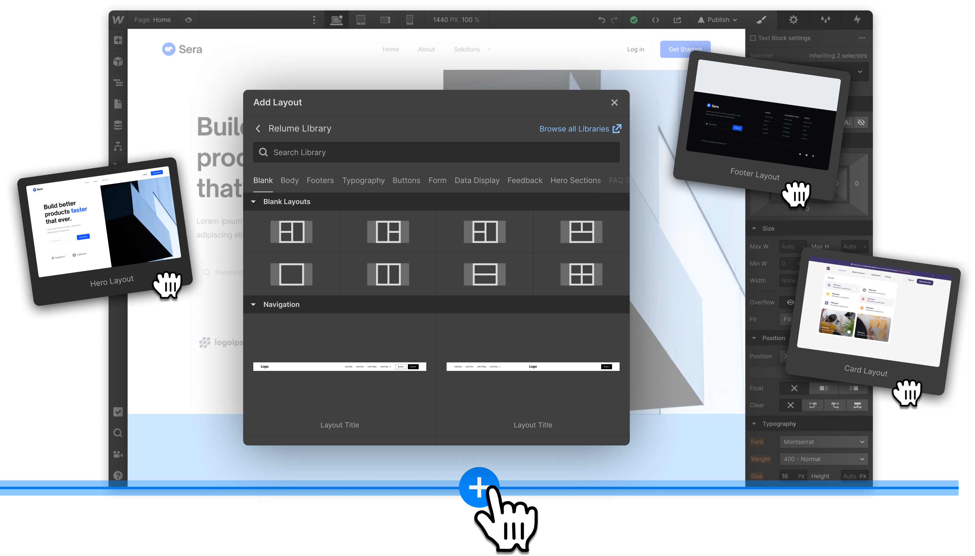
The annual Webflow Conference was around the corner, and the new "Libraries" feature was slated for public launch. Libraries are collections of pre-built layouts that help you build pages quickly. However, at the time of launch, this powerful new feature was hidden in the side-bar menu.
We knew that our existing pre-built layouts improved activation and conversion for new customers, so we wanted to make new Libraries discoverable while also empowering novice users to build right on the Canvas without digging for them.
Project
Building quickly with Libraries & Layouts
Role
Lead designer on growth team
Objective
Reduce "creators-block" for new users.
The "blank-canvas / creators-block" challenge
Problem
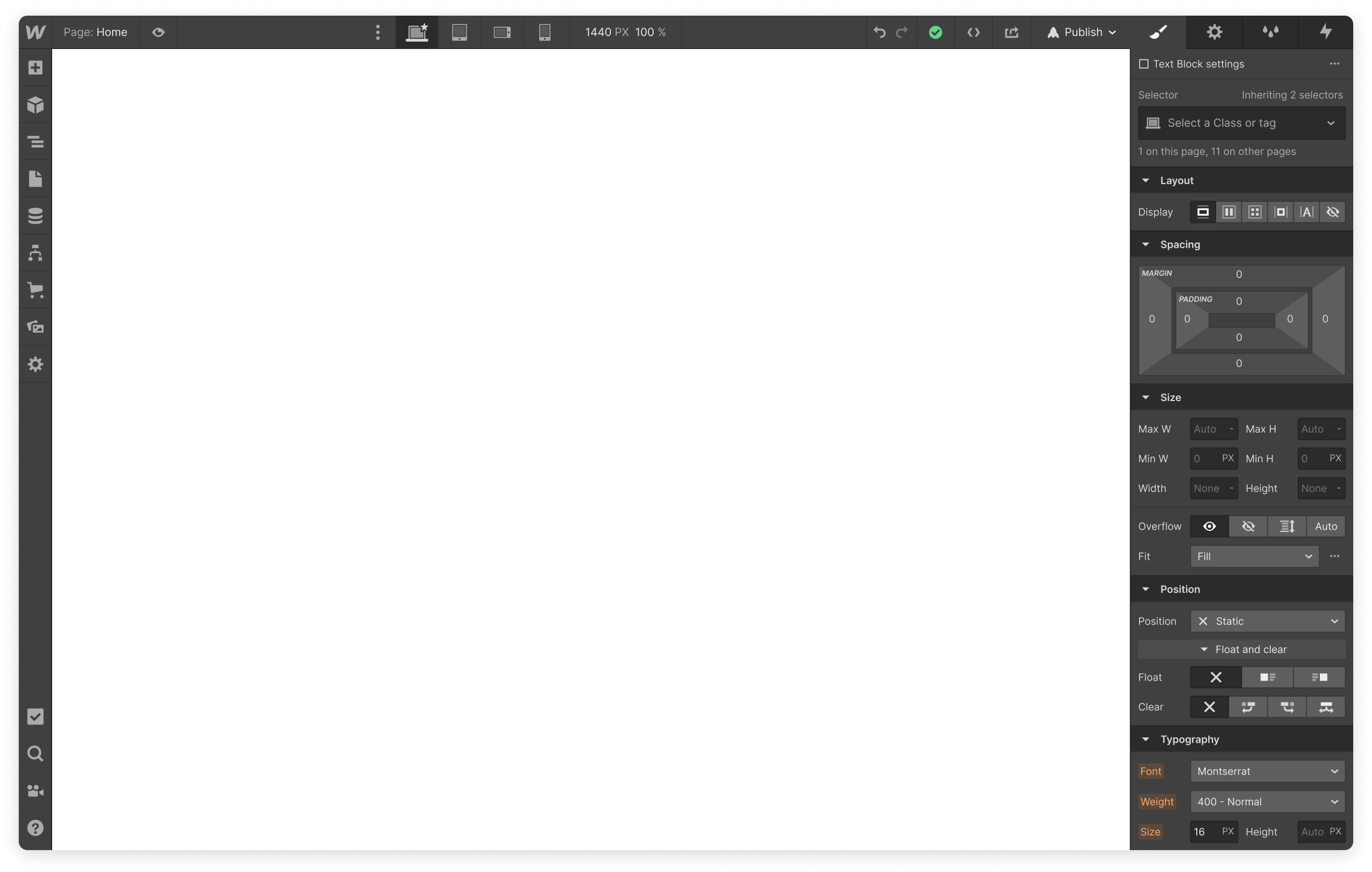
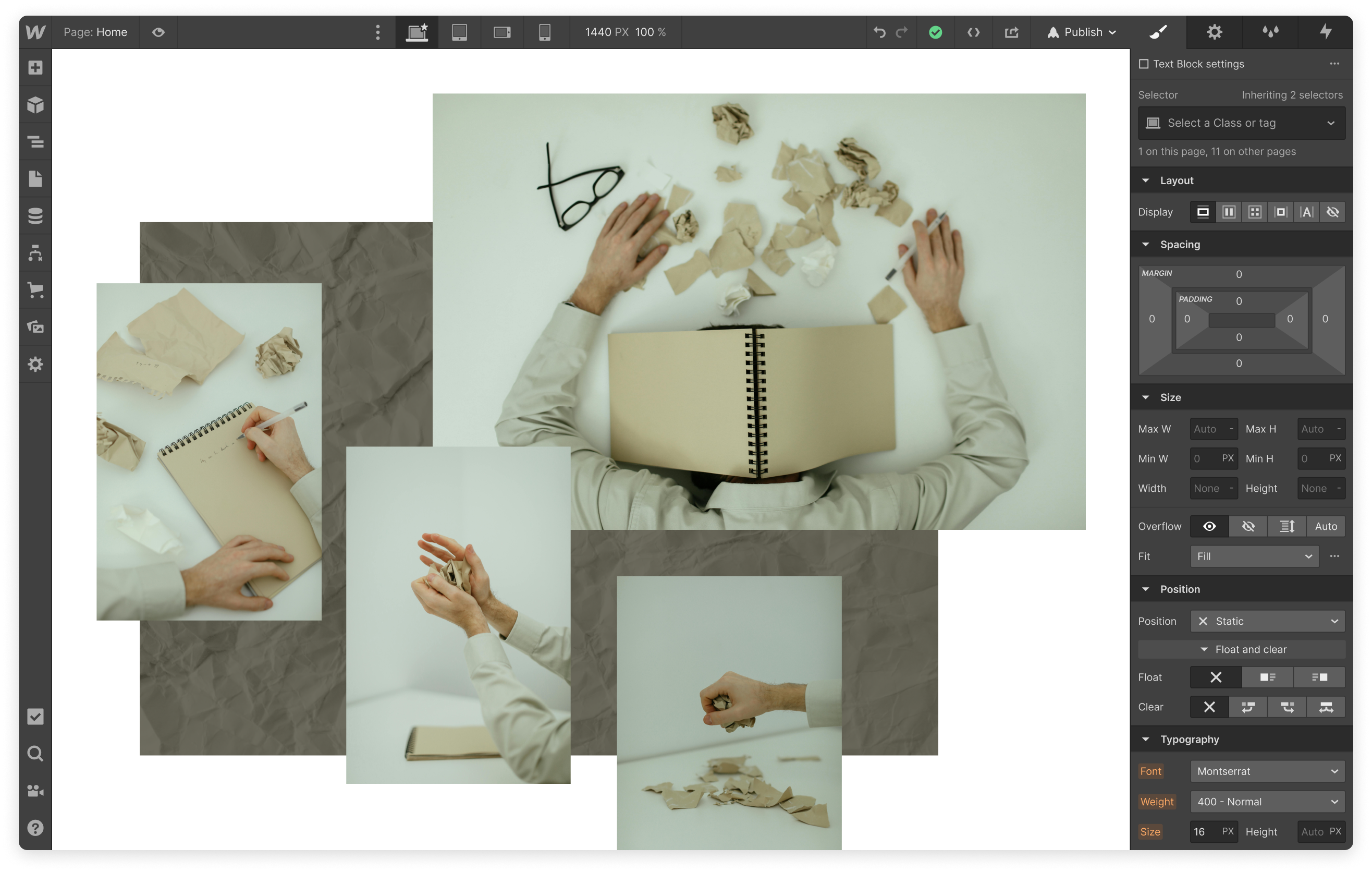
New & novice users often face “creators-block” when looking at a blank canvas and give up before building their first page. Building with "Libraries" makes it much easier to quickly get up and running with pre-built and styled sections. But, at launch, the new feature is hidden deep in the menus in a tab called "Layouts."
We know that blank sites fuel the majority of first-site activation for or target customers (60%-70%). Let's reduce let's reduce "creators-block" for new users.
Goals
User goals
I want to build a beautiful and useful page as soon as possible without getting bogged down in technical details.
I want to learn by doing – I don't want to watch a bunch of tutorials.
I want to see results right away.
Business goals
Improve activation and conversion for new customers.
Help new users start building with confidence.
Reduce steep learning curve for non-technical users.
Encourage the adoption of Libraries.
The Solution: Make the first step obvious & next steps easier
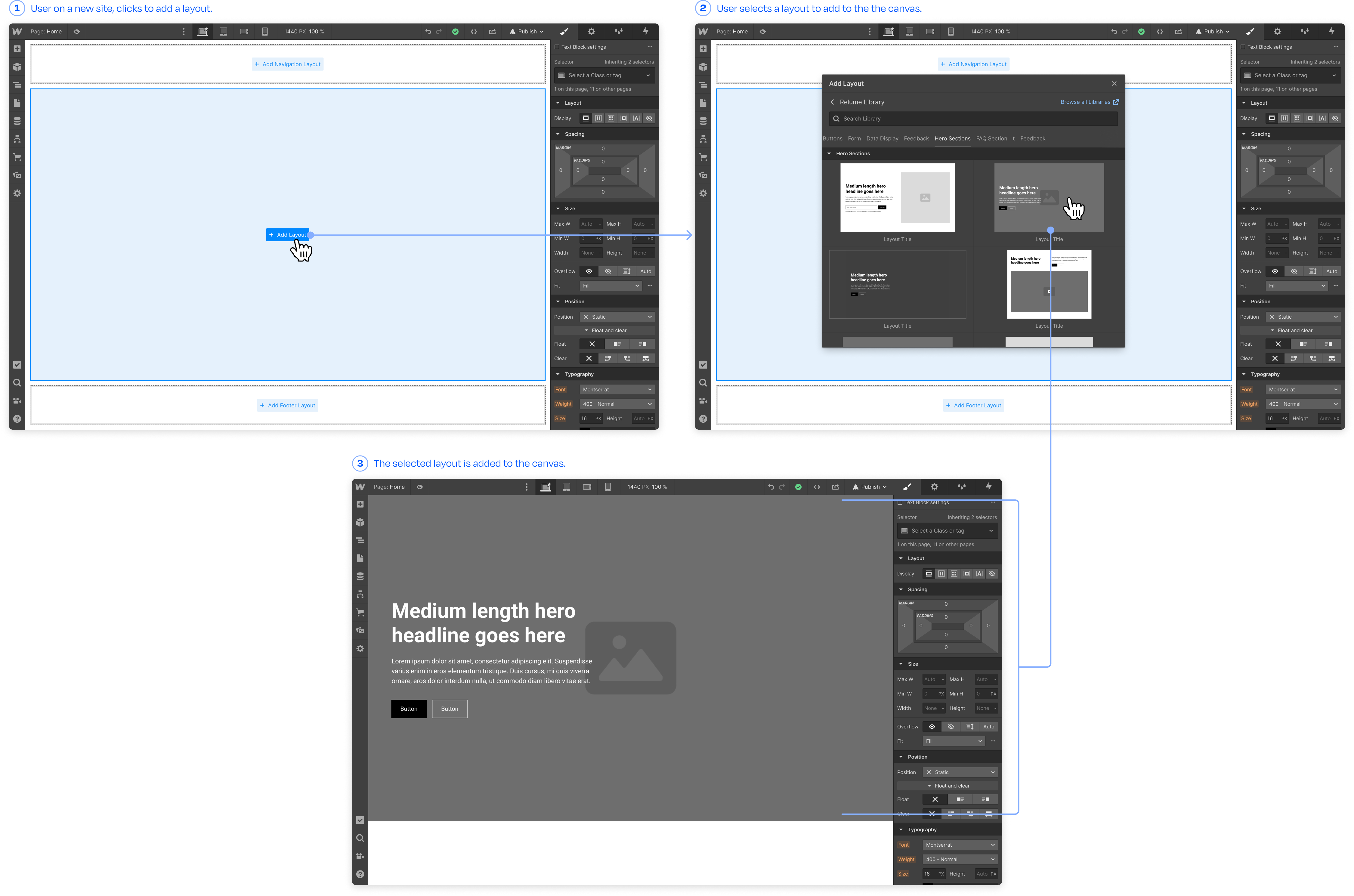
Build directly on the canvas
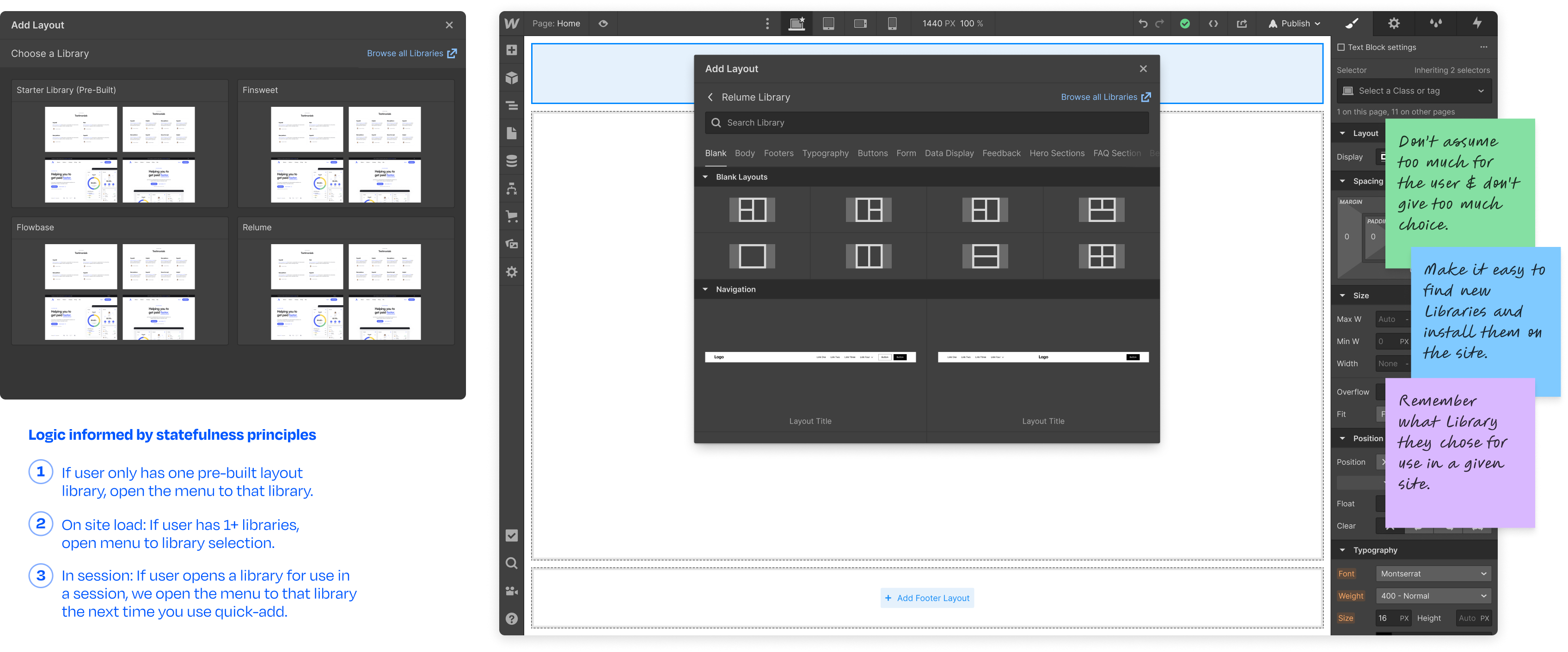
We added a quick-add action directly to the canvas that allows users to quickly build pages with pre-built and professionally styled Layouts at the speed of thought. The idea is to reduce time-to-value for new and novice users. As a new user, I want to see how to start building full pages immediately.
Quick-add menu like a command palette
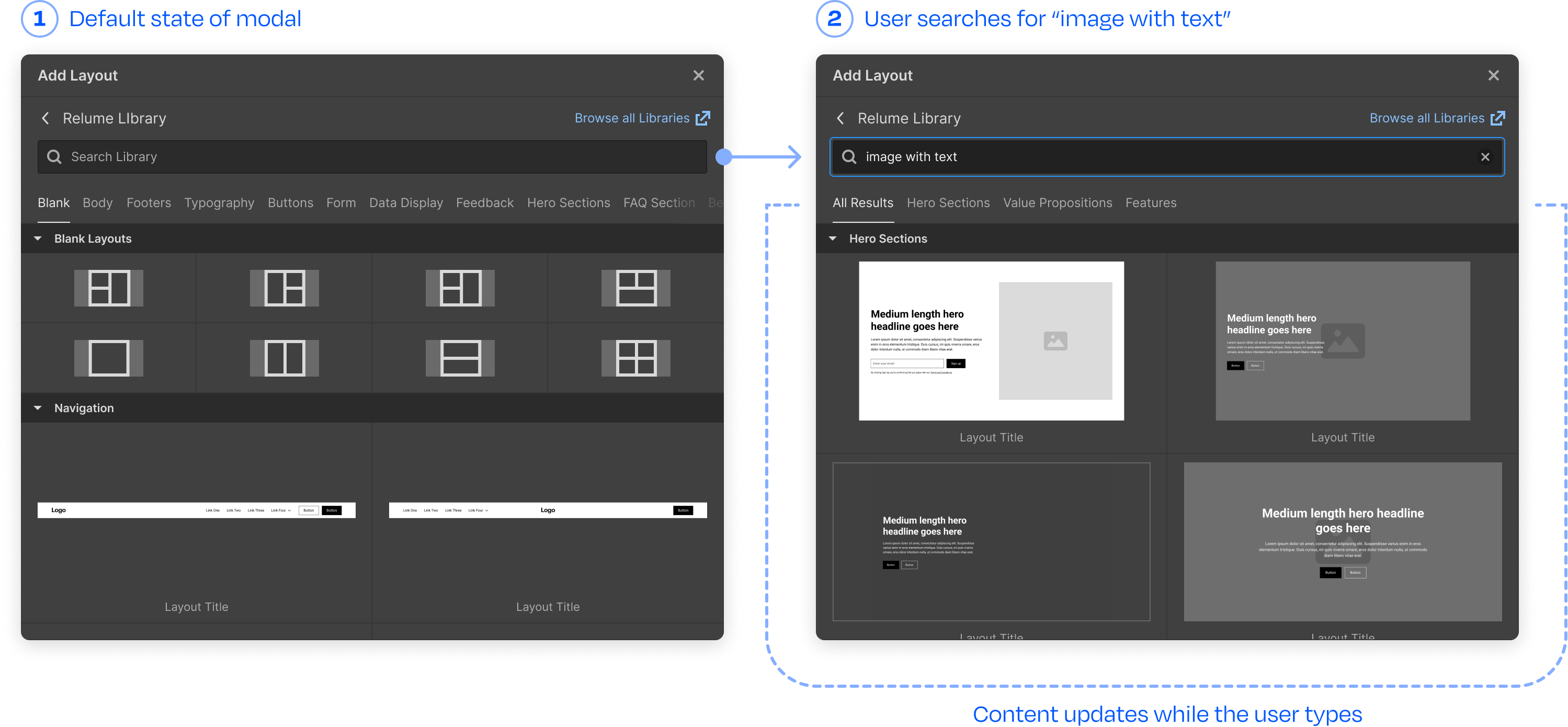
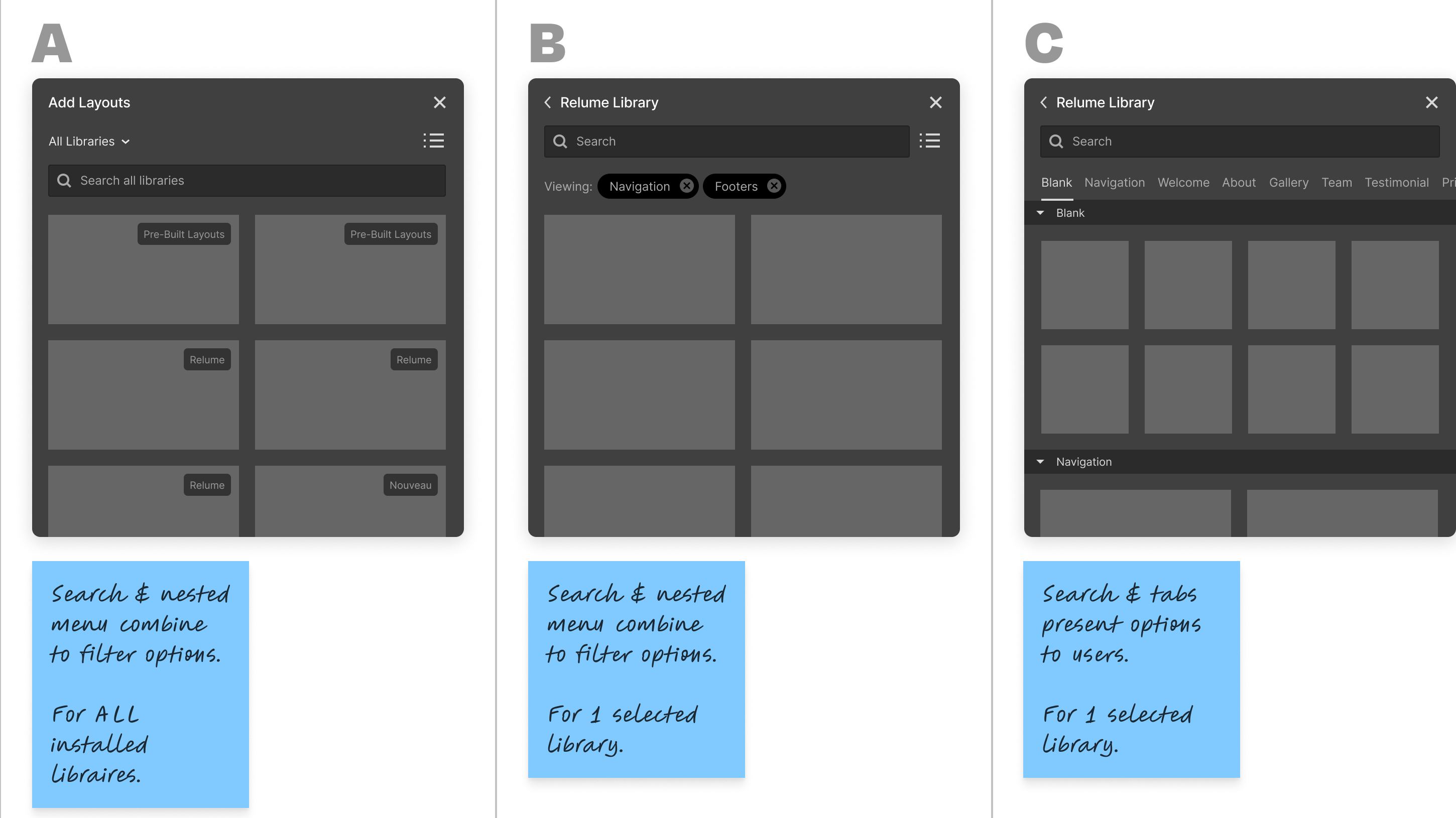
Building actions on the canvas was just the start. Once the user clicks to add a layout, it must be easy to find the "building block" or "section" they envisioned. To help them achieve this, I designed a quick-add menu inspired by command palette interaction patterns. Content updates while searching, helping the user select the right layout and make sense of the available categories.
Build momentem when buidling
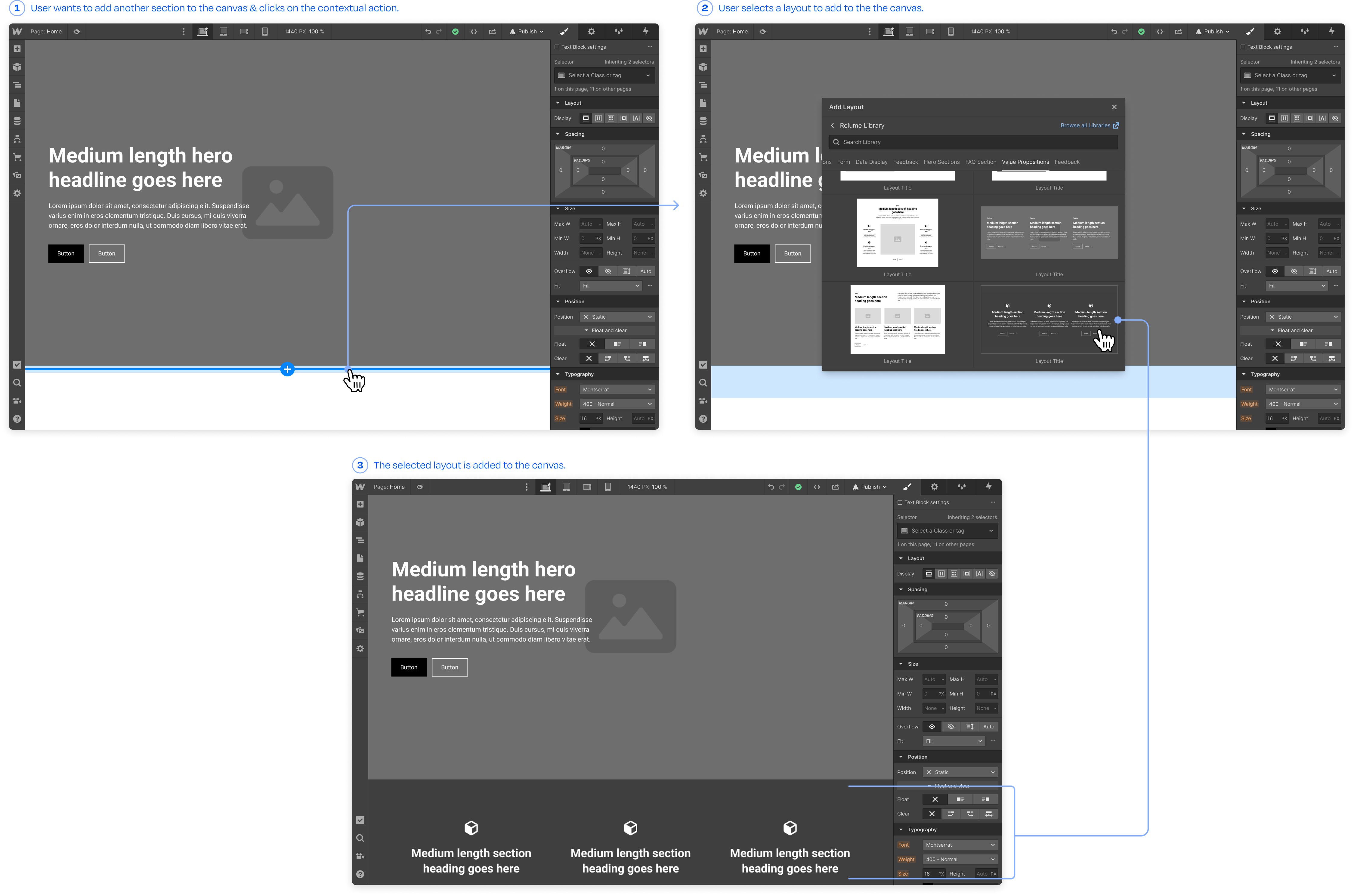
Empty-state actions solved the blank "blank-canvas/creators-block." But what happens after a few sections are on the page? I created secondary interactions that appear when hovering above, below, and in between sections. This allows for quick chaining together of sections and is especially useful when quickly building landing pages from a Library.
User-Focused statefulness
It was important to strike a balance between letting our users choose their own adventure based on their goals and giving them helpful guardrails. So, I established a few principles to help us make decisions around different states our user's would encounter.
Insights
Don’t assume too much for the user & don't give too much choice.
Make it easy to find new Libraries and install them on the site.
Remember what Library they chose for use in a given site.
How we got there
Confusion & growing pains: what are Libraries even?
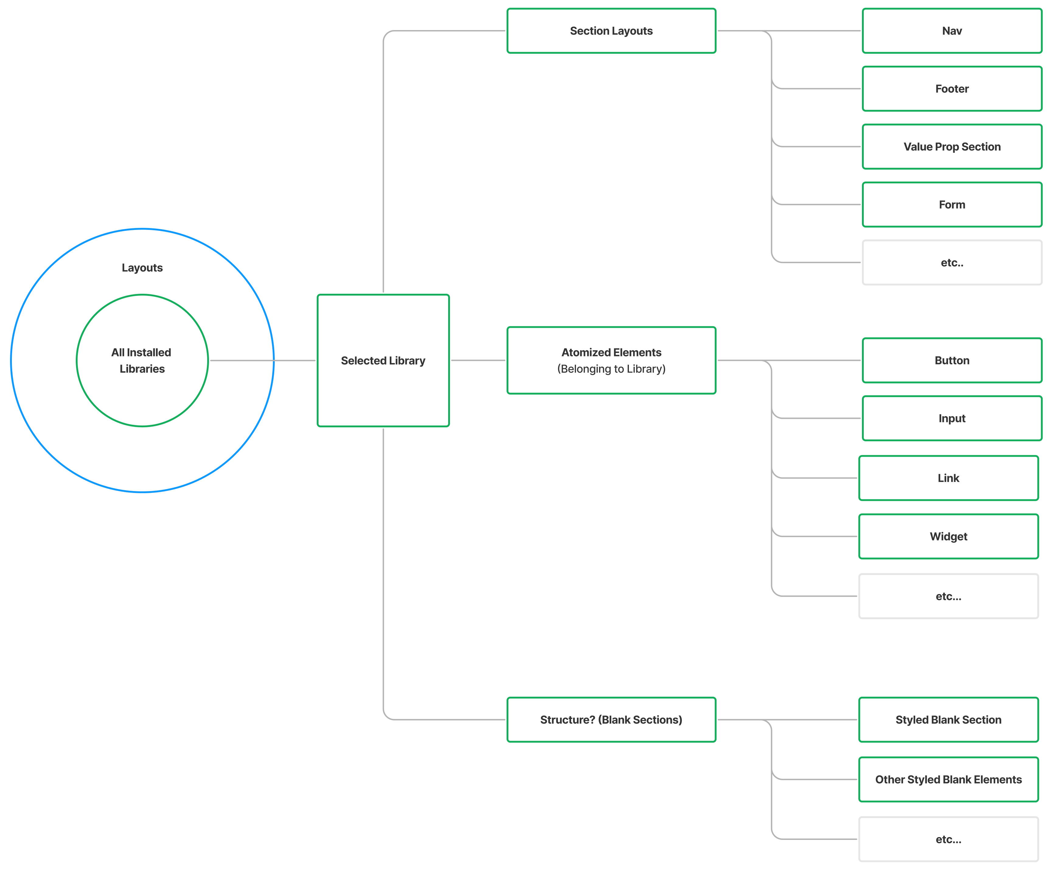
Our team set out to make the new Libraries feature more discoverable and useable, but along the way, I found many cases where Libraries conceptually overlapped and even contradicted other methods of building in Webflow. The positioning of Libraries at that time was not clear. So, I began forming a POV and taxonomy of Libraries to inform current and future work.
How do others do it?
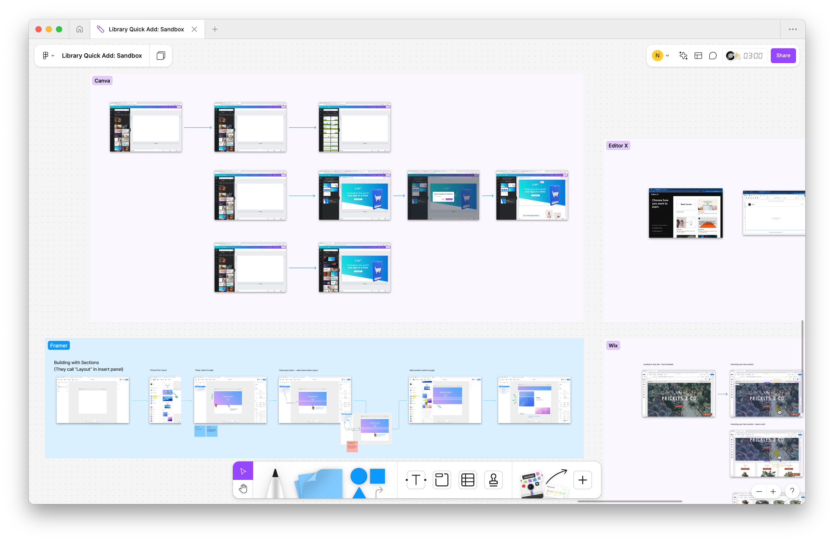
I audited a handful of popular no-code tools to see how they used on-canvas actions and nested menus to present the user with building options. These tools sat on a spectrum. On one end, mapping closely to HTML & CSS. And on the other, abstracting the code away for simple visual building. The former required more expertise of required ingredients. The later was more like selecting your lunch from a menu full of beautiful images.
Design exploration to cast vision
When competing tools mapped closely to code, building complex decisions and sifting through menus to find the right thing. If the tool was abstracted away from code, building was more like selecting whole page sections based on their job to be done. I partnered with my product partner to envision how building could be easy for new and non-technical users to build their first page.
Arriving at the MVP
Our hypothesis: bringing quick-add controls onto Canvas will help new users build the initial structure of their site and find value in Webflow faster.
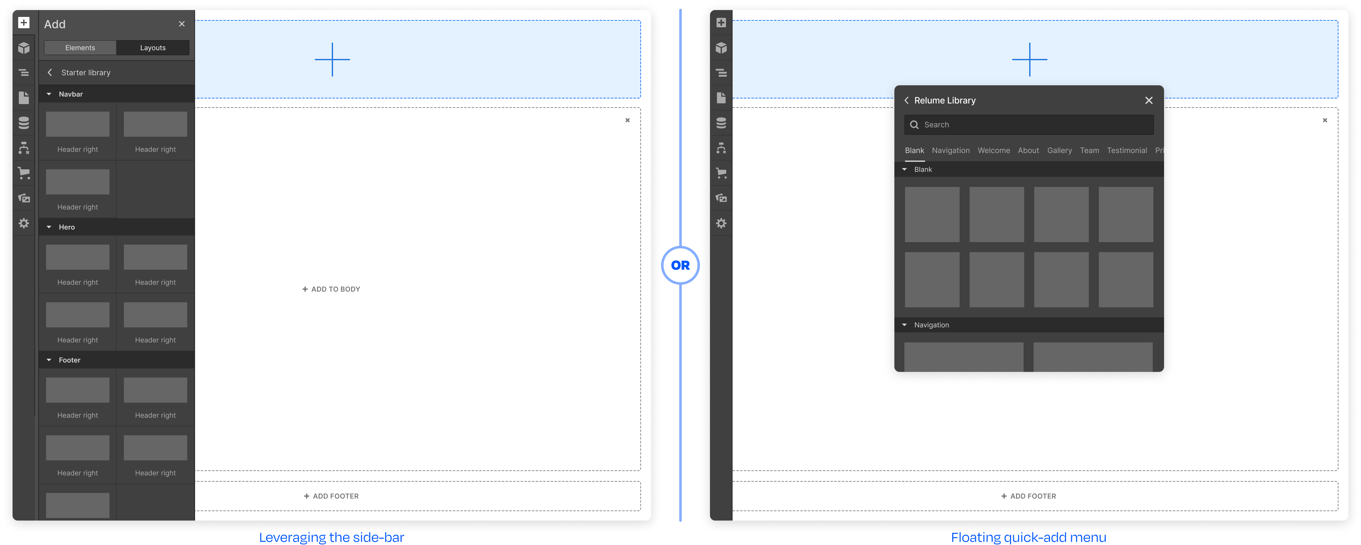
Most of Webflow's building tools lived in the right-hand sidebar. For our experiment, we introduced a new flow that would not compete with mainline features and extensive customer-facing documentation. Once results were in, we would take learnings and further develop winning patterns or adopt winning functionality into existing patterns.
It was important that we did not disrupt user expectations for mainline features, so going with the floating menu allowed us to run a statistically significant test without confusing users.
Impact & reflections
The new Libraries feature was hidden at launch, and our hypothesis was that interactions on the canvas would unlock quicker page building and value. We knew that new users would sometimes freeze when looking at their blank site, especially those on the non-technical spectrum.
So, we married existing value in the new Libraries feature to existing patterns within the design system. Collaborating with my product manager and engineering lead, I modified selected patterns to create a custom experience without reinventing the wheel. We carved a path within the product that would allow us to test and incorporate new winning features into mainline patterns.
We were on the right track, but upon reflection, we could have broken this experiment into multiple parts: (1) On-canvas controls to access section-level buildings and (2) Making libraries more discoverable.
While we learned that on-canvas actions did give users a quick way to start, there were other upstream decisions that the user needed to make that would free them from creative block. For example, we learned that starting with a whole-site-template moved the needle more.
Work About
