Redesigning the Feather storefront
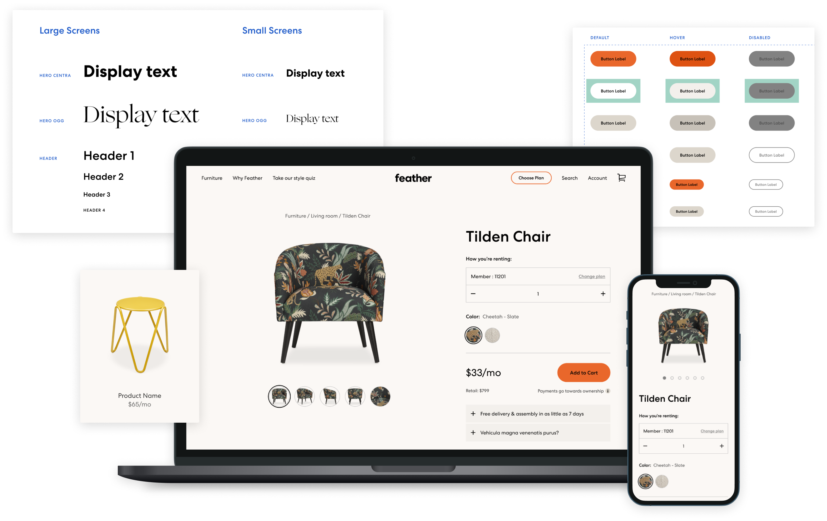
In two months, I led our product team to redesign Feather's website to highlight our new brand and make a stronger connection with our customers.
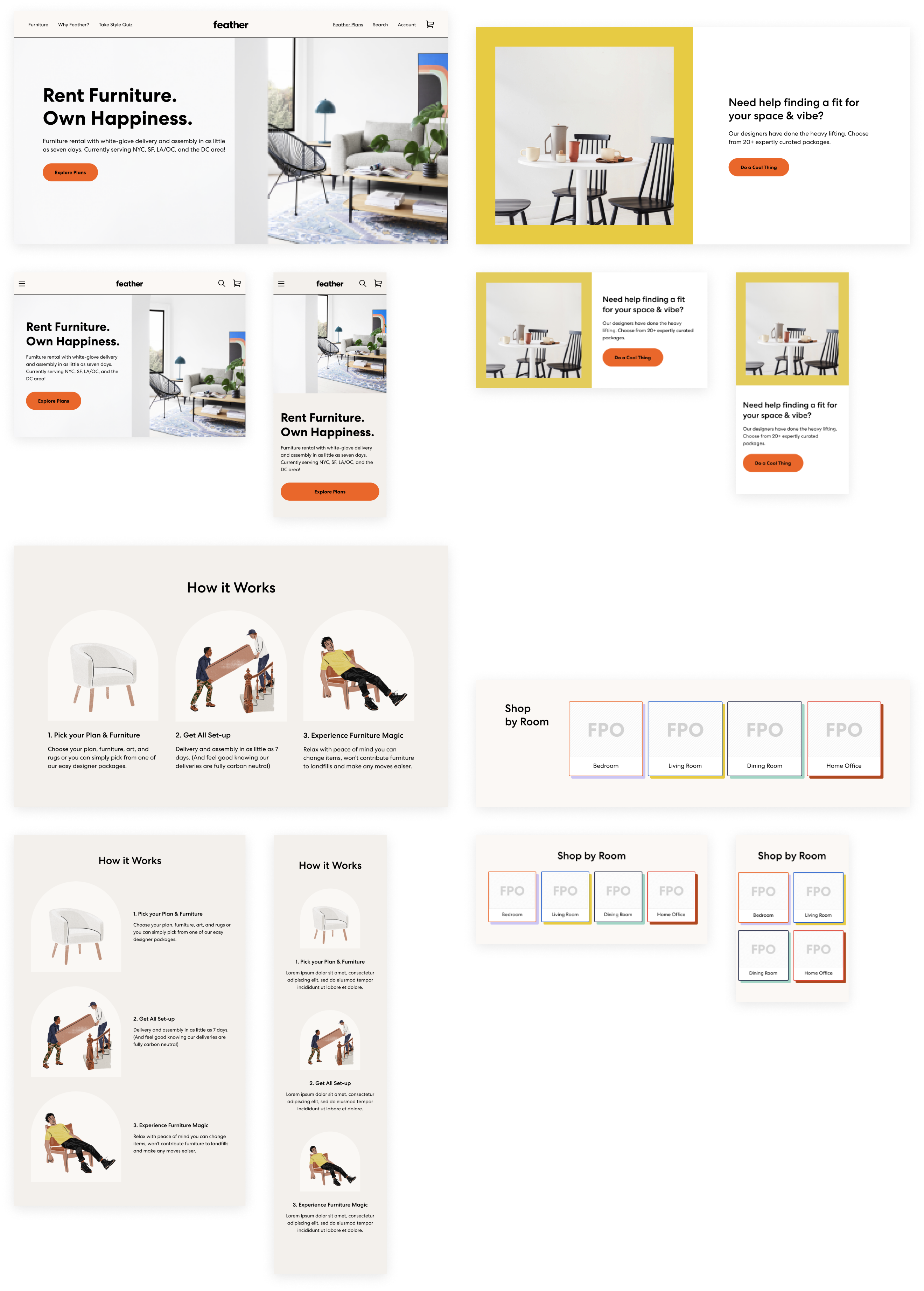
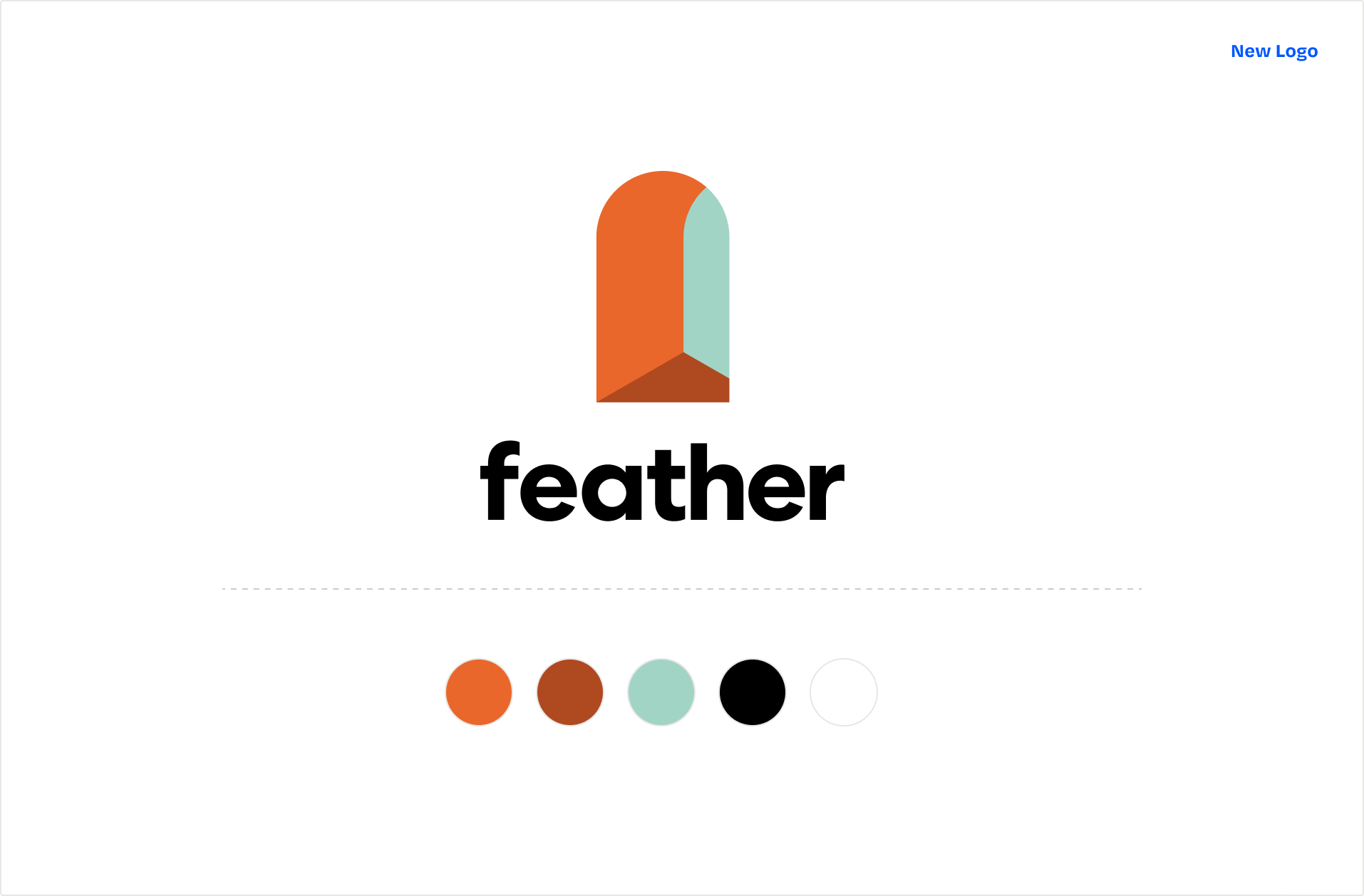
We just closed our Series B funding, and it was time to level up our brand. Our marketing team took the opportunity to create a fresh new identity to support our in-house furniture launch and to establish ourselves as home tastemakers. Our product team ran with the new assets and redesigned and rebuilt our website to be modular, usable, and beautiful.
Project
Redesign of Feather's ecommerce website
Role
Lead designer on agile team
Objective
Refresh our website to better connect with customers and communicate their mission.
The "brand refresh" challenge
Problem
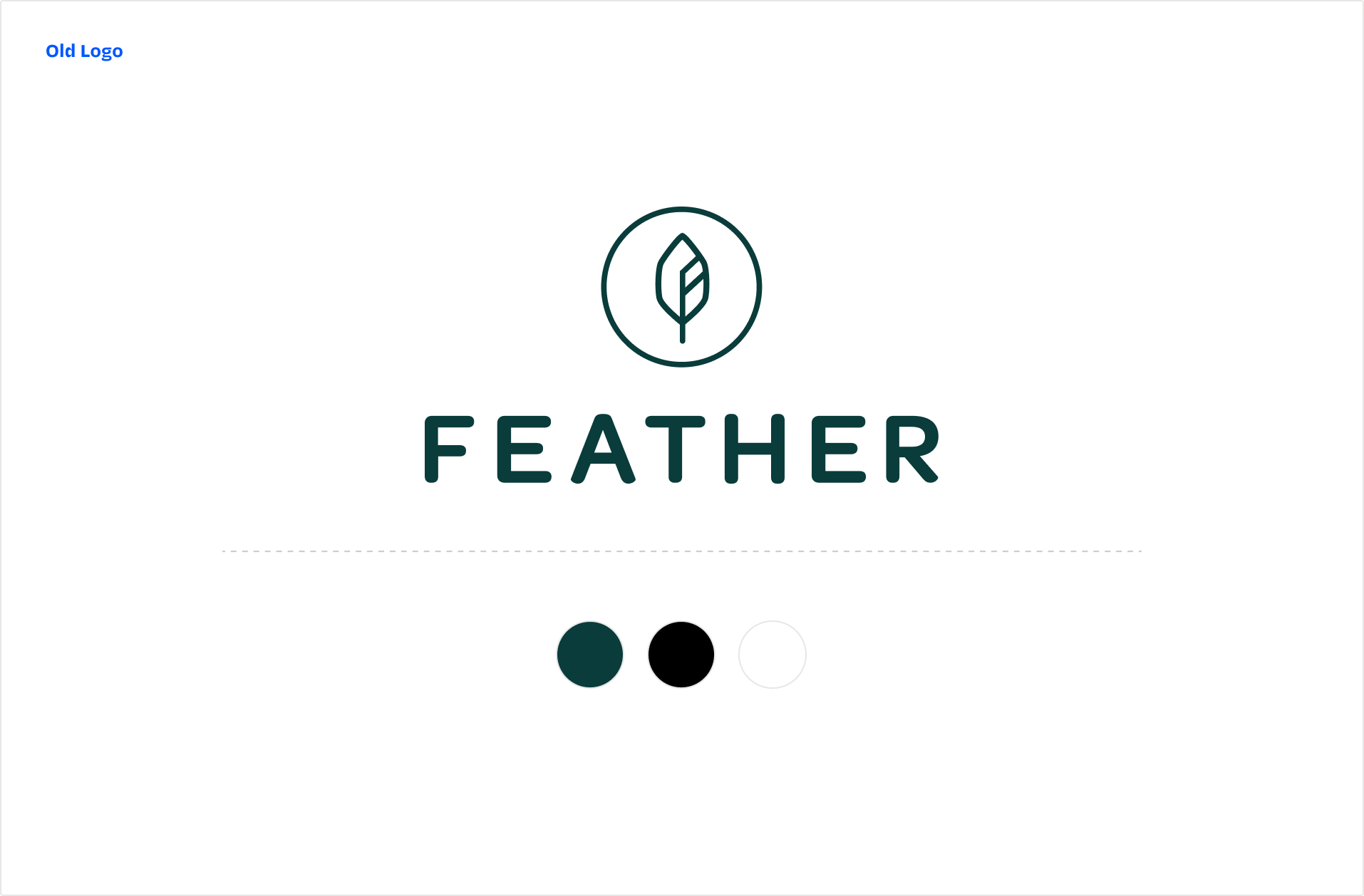
Feather has been rocking the same look & feel for years. It served us well up to this point, but it’s starting to feel a bit stale. We’ve established the urban furniture rental category, but now we’re struggling to stand out among our competitors. We’re flattered to see many look-alike newcomers, but it’s time to differentiate ourselves in the market. How far do we push these changes on the website?
Goals
User goals
I want to know that Feather cares as much about the overall experience as they do about the furniture.
I don’t want to second-guess Feather’s message and value. Shopping on the website can feel disconnected from Feather’s advertising.
Business goals
Apply our new look & feel to the website to create a fresh and relevant shopping experience.
Align the website with marketing efforts to build brand consistency and affinity.
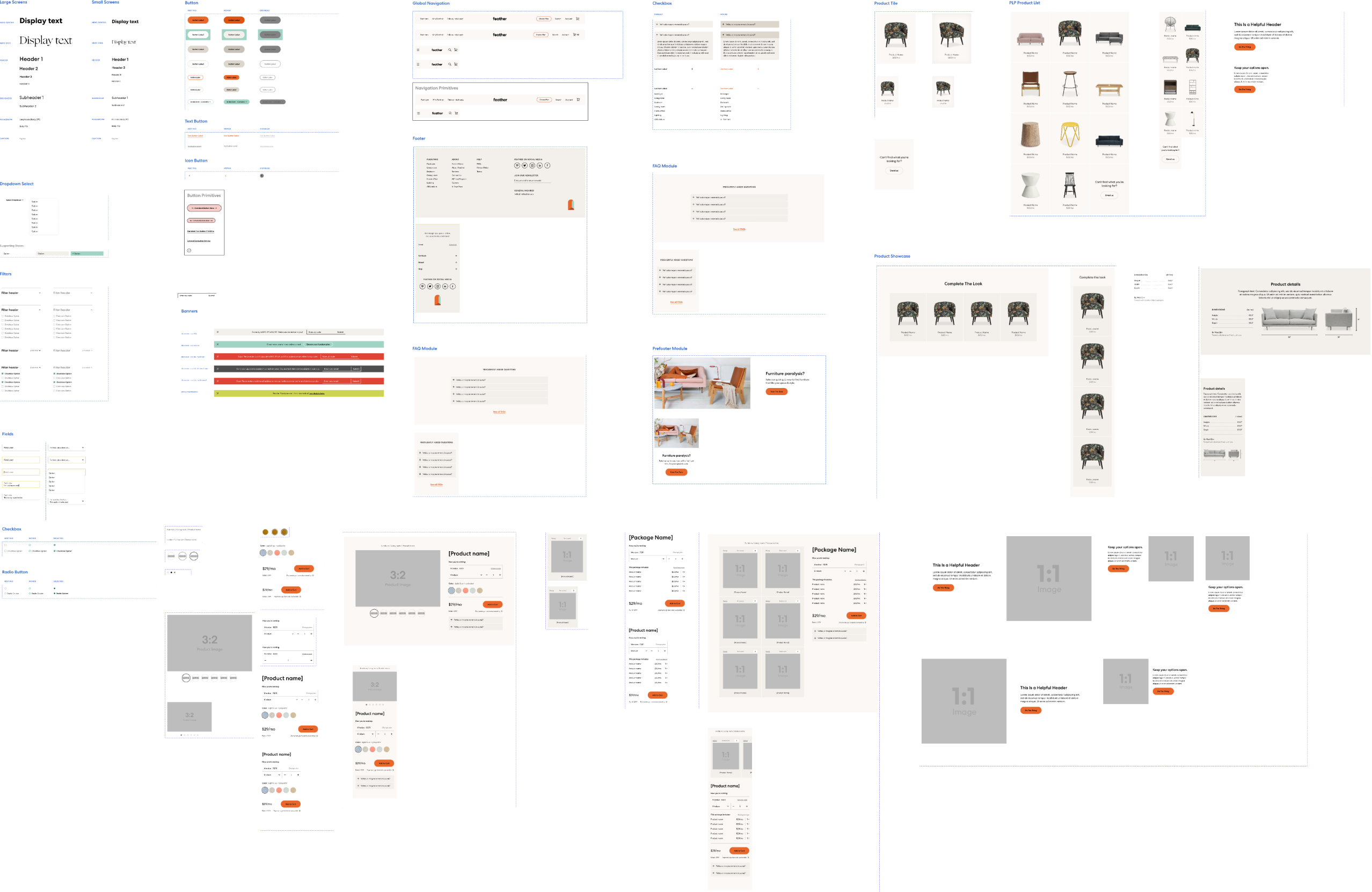
Create a design system that we can build upon and reuse for years to come.
The solution: A resilient design system under the hood
One component library to rule them all
The first order of business was to do an audit of our existing component library in Storybook. I found that most of our components were closer to modules (or component groups) that lacked flexibility. The individual building blocks were fused together and hard to reuse. So I broke these apart into smaller atomic pieces that would make them easier to apply in different combinations.
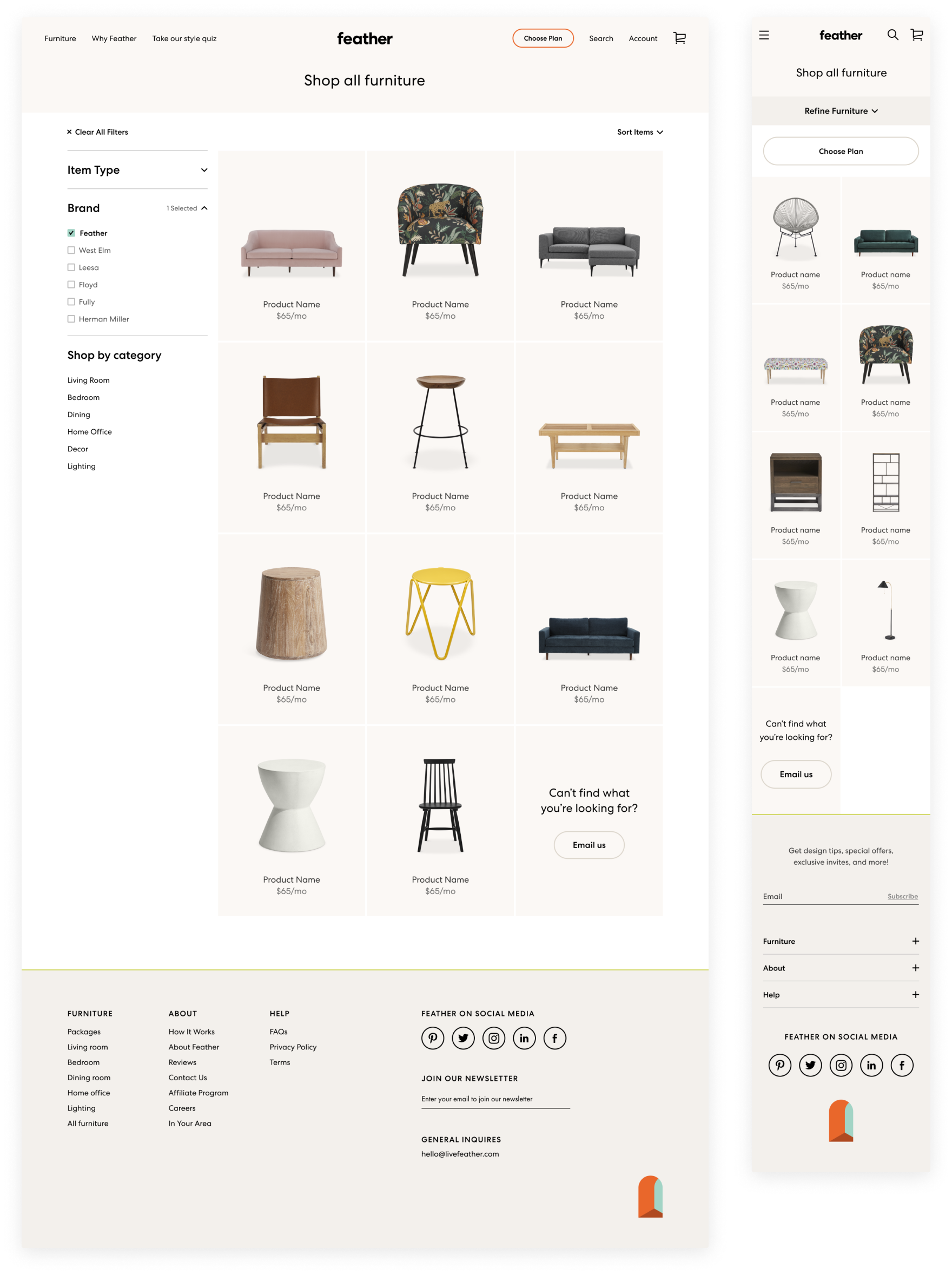
The product listing page
Once I defined the basic components, I explored how they could be applied to the product listing page. Our customers land here after a quick stop on the homepage or after following a social media ad. Showcasing our beautiful in-house furniture line and making it easy to filter down to specific items was the primary goal.
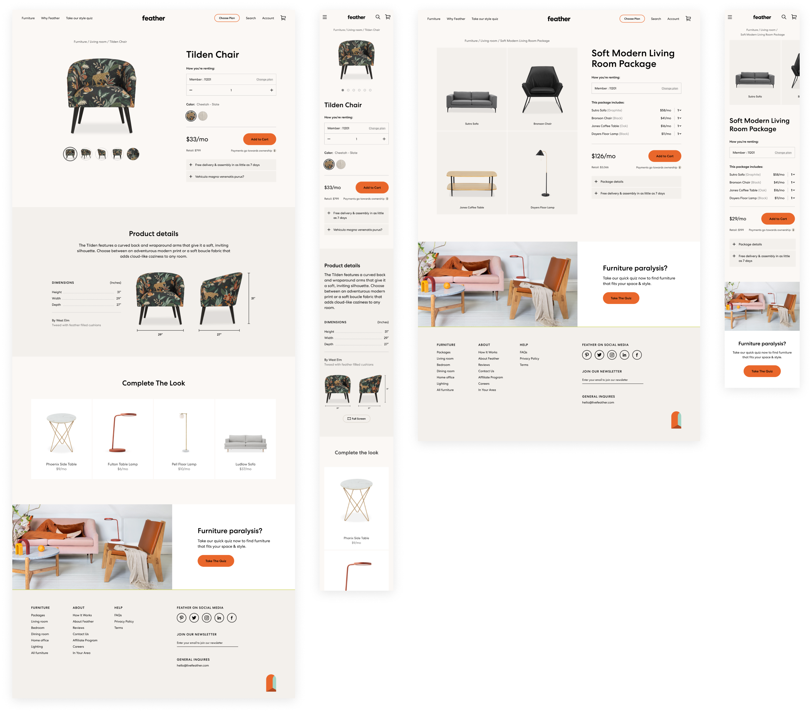
The product & package detail pages
Our customers use the product and package detail pages to dig deep and decide if the furniture they’re considering is right for them. Whether a single piece or a curated package, we give users just enough information to add to their cart or move on to something more suited for their needs. I surface previously hidden dimensions and product details and clarified the item selection and the add-to-cart CTA.
Beautiful on large & small screens
Seventy percent of Feather's customers shop on their phones, so it was critical to take a mobile-first approach. I worked with the engineering team to establish a responsive grid, type styles, components, and modules (component groups) to make sure our website worked beautifully on all screens.
Work About
